
All work
Brand identity / 2026
Pre-launchBonga
A cheeky, bright brand for tipping the person who waves you out of a parking bay.

- The brief
- Everyone in South Africa knows the moment: the guard waves you out and your pocket holds keys, a card and no coins. The brand had to make going cashless feel generous, not clinical.
- What we did
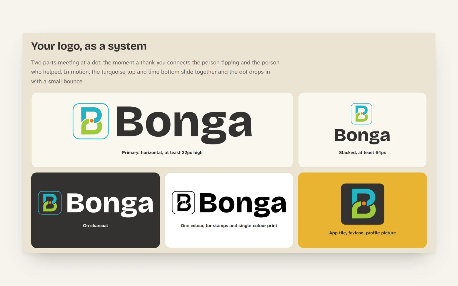
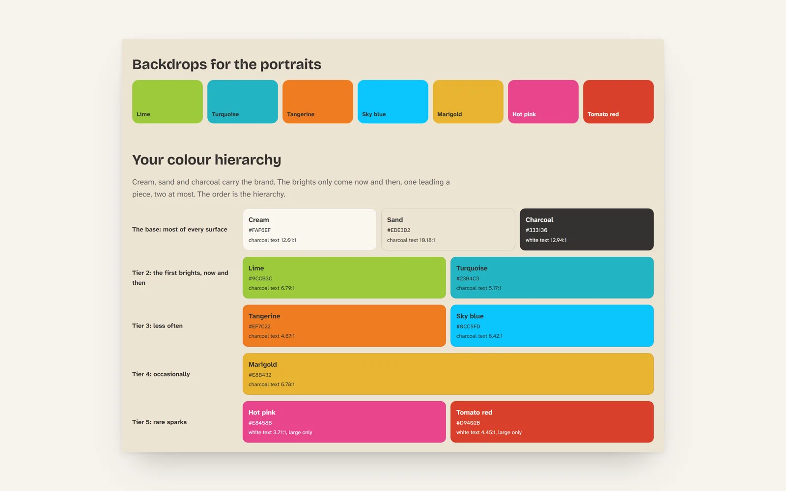
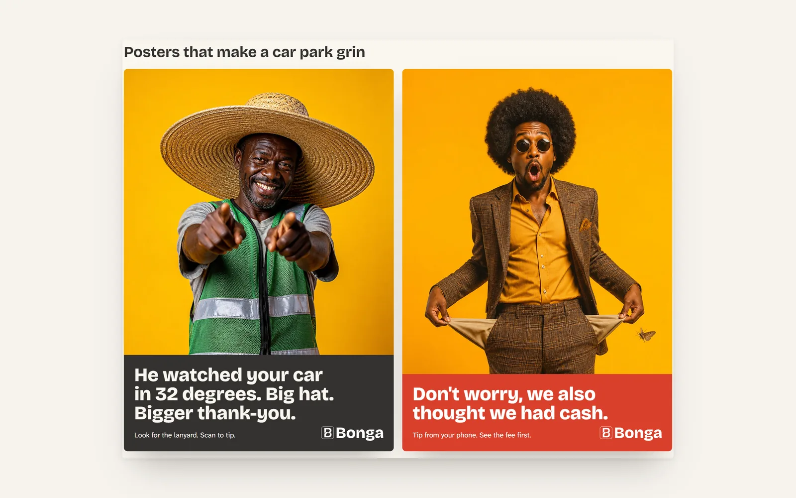
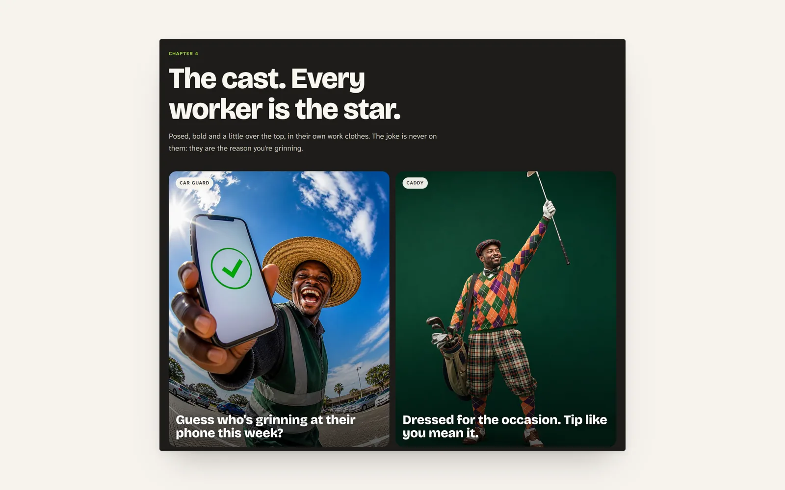
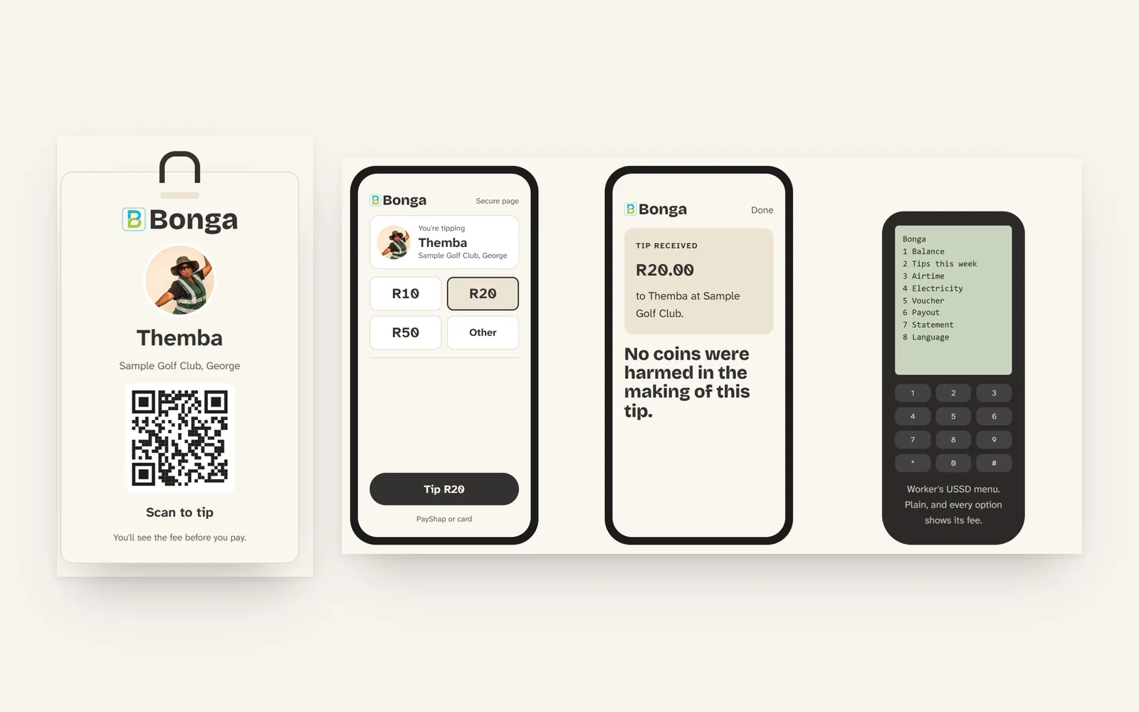
- We built the brand from the strategy up: the voice, a bright palette that holds up in sunlight, type, the cast and the look of the campaign, and the card a guard wears to be tipped.
- The line
- Going cashless shouldn't mean going tipless.
Gallery
Next project
FuelTap - Apps and softwareIf this looks like your problem, start there
Tell us about your business, where you are now and what you want to achieve. We will tell you honestly whether we are the right people for it.