
All work
Brand identity / 2026
LiveFuelTap
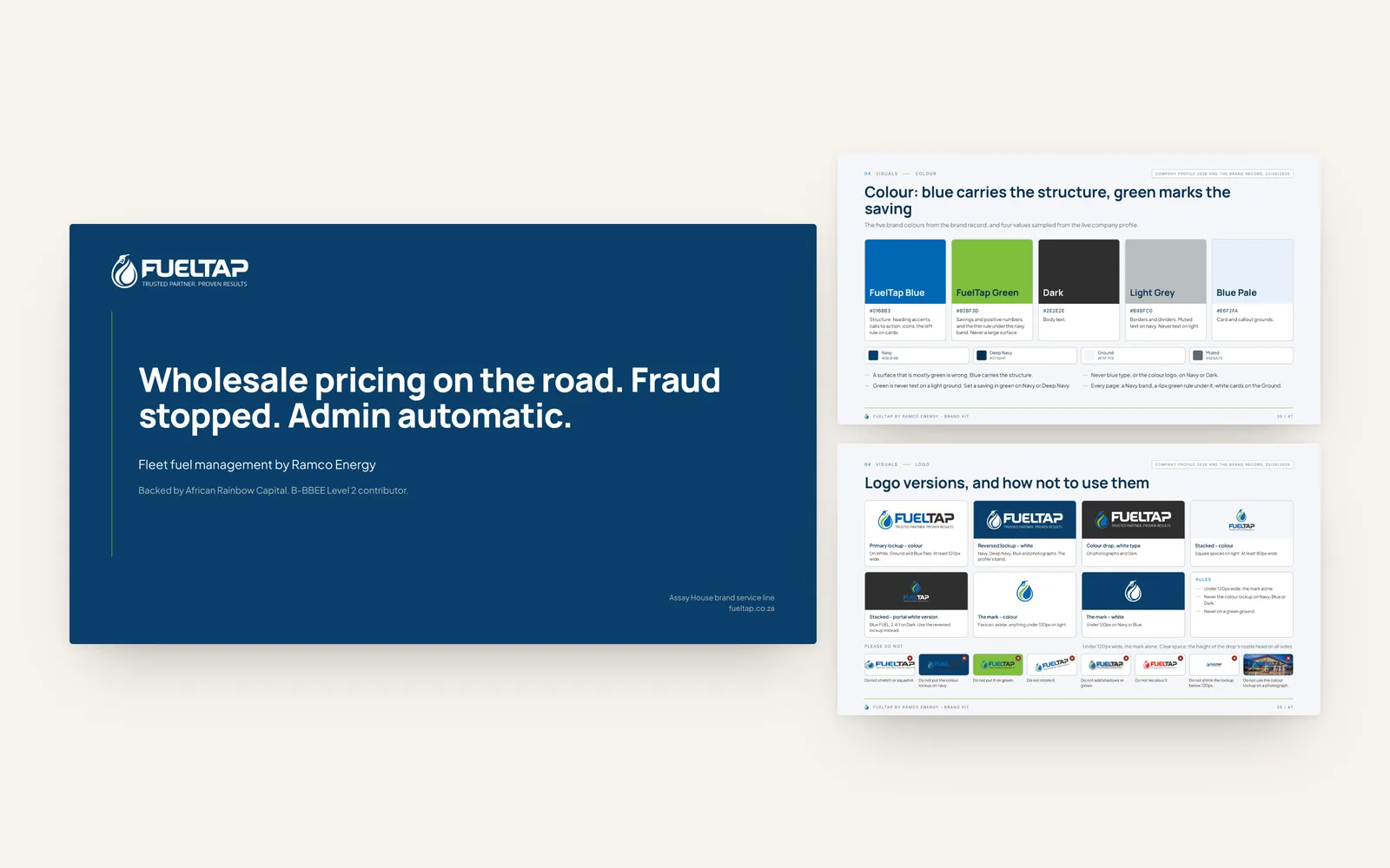
A 47-page brand kit that turned an existing logo into a working brand system.
- The brief
- The logo existed. Everything around it was improvised, so every proposal, slide and email looked slightly different from the last, in a sector where buyers judge reliability before they read a word.
- What we did
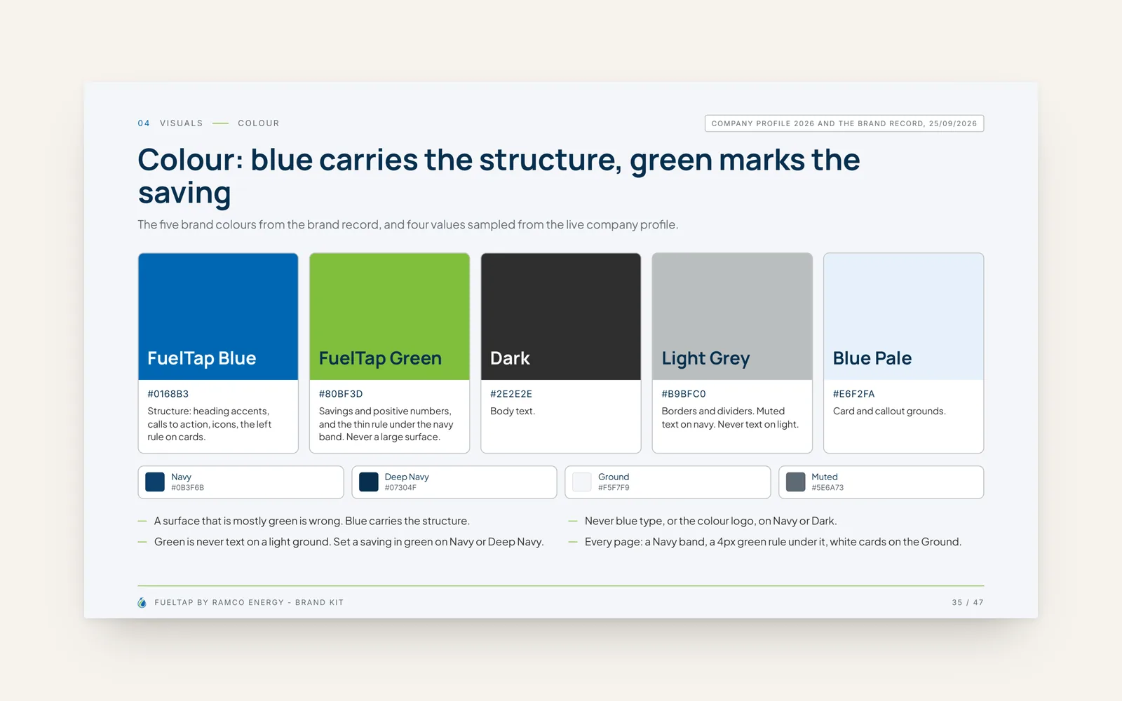
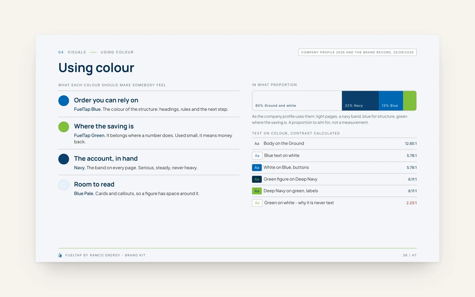
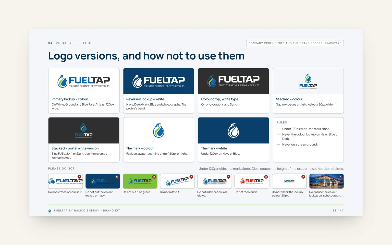
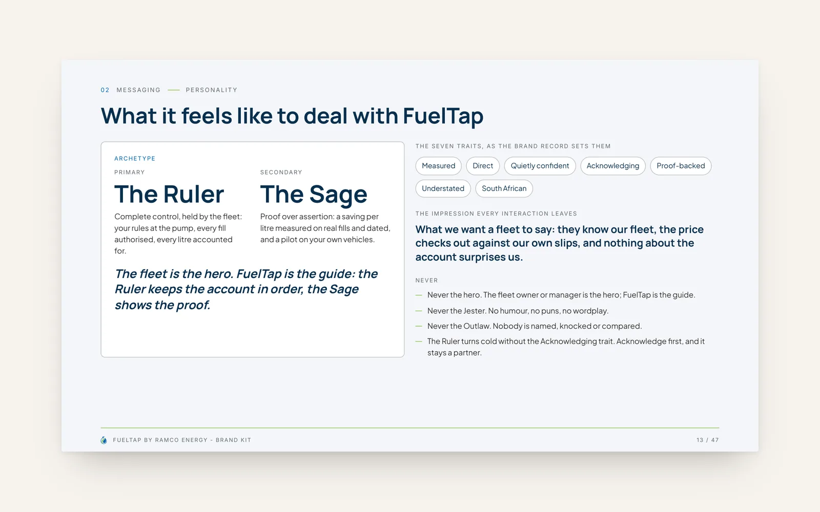
- We built the brand kit around the existing mark: colour with a job for each (blue for structure, green for the saving), type, logo versions and how not to use them, and the personality the sales team writes in.
Gallery
More for FuelTap
Next project
QRTip - Apps and softwareIf this looks like your problem, start there
Tell us about your business, where you are now and what you want to achieve. We will tell you honestly whether we are the right people for it.