
All work
Brand identity / 2026
LiveQRTip
A brand for cashless tipping that speaks to the person being tipped, not just the venue.
- The brief
- Tipping is going cashless, and the people it hurts first are the waiters, therapists and baristas who used to go home with it in their pocket. The brand had to earn the trust of venue owners and staff at the same time.
- What we did
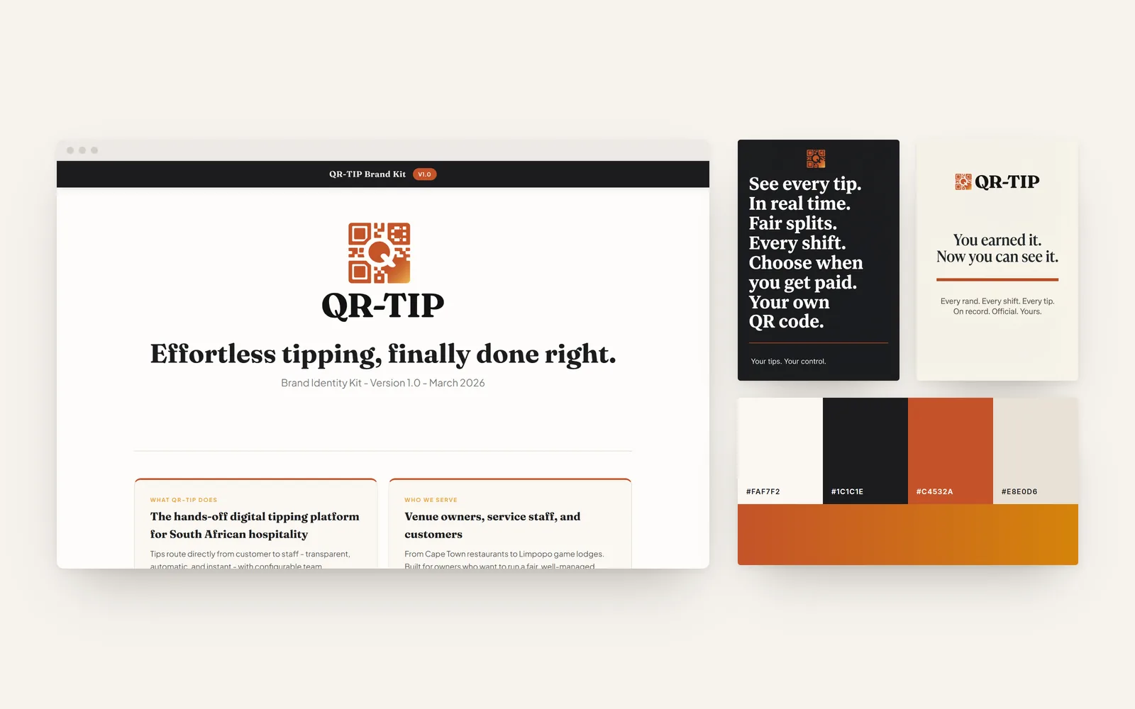
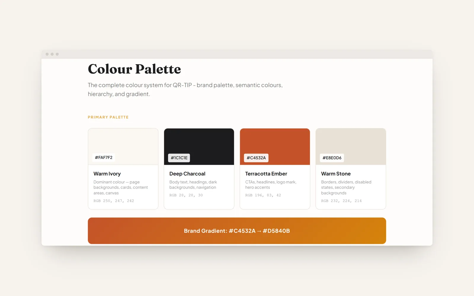
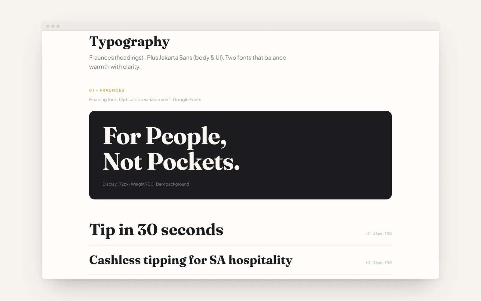
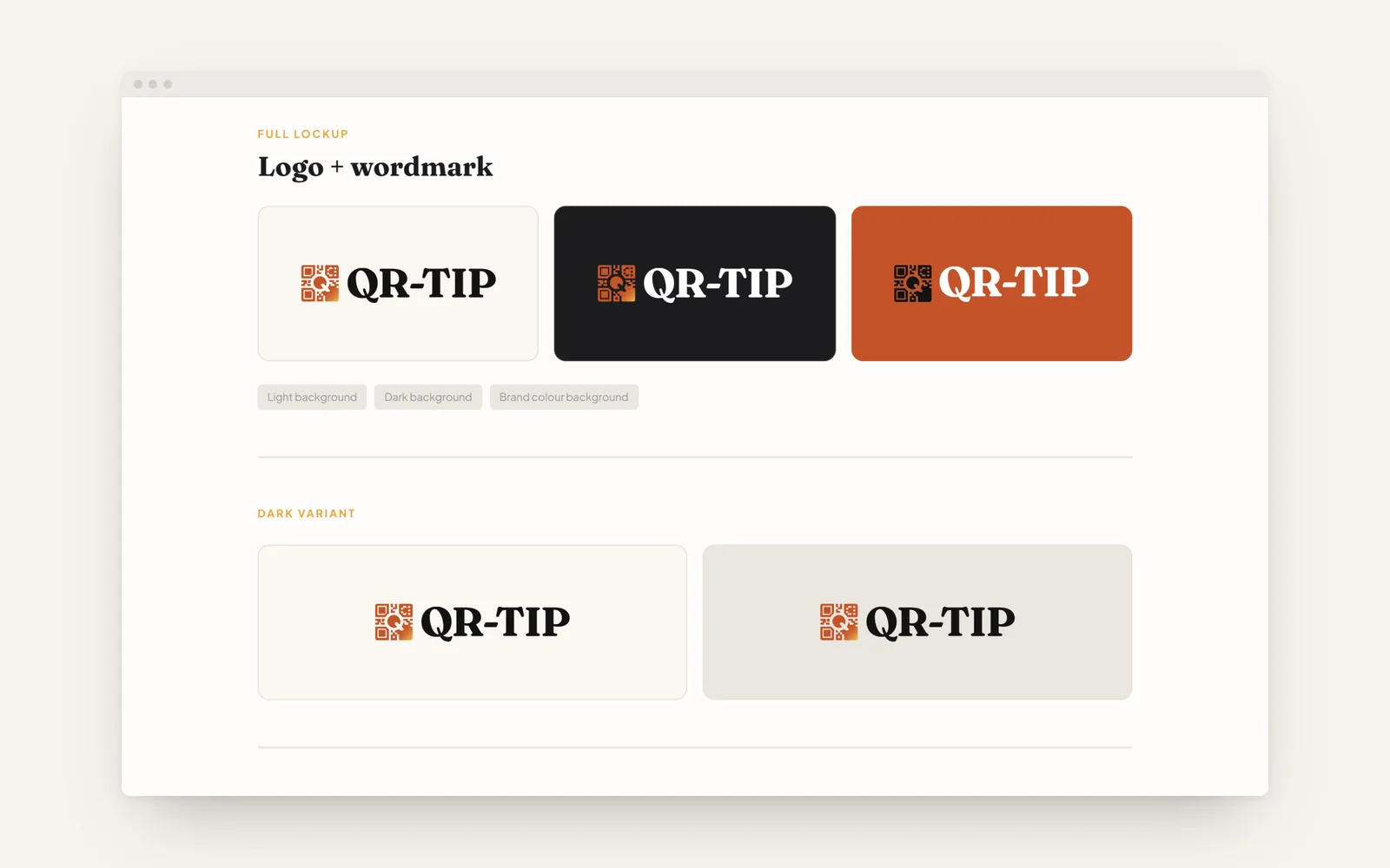
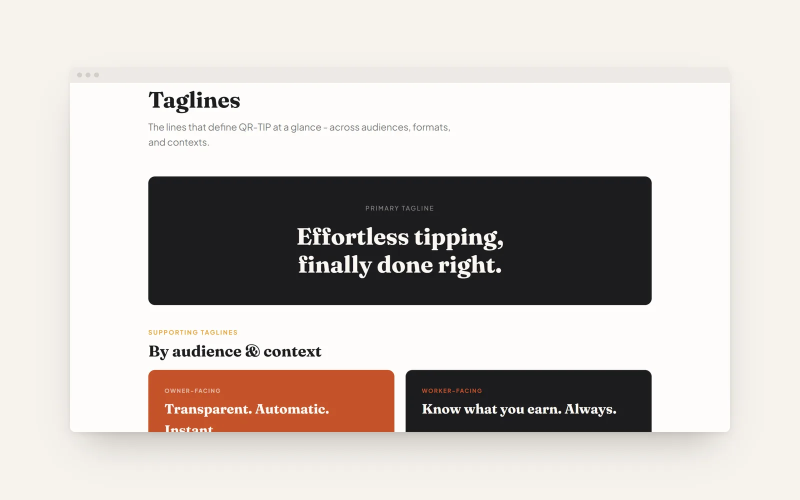
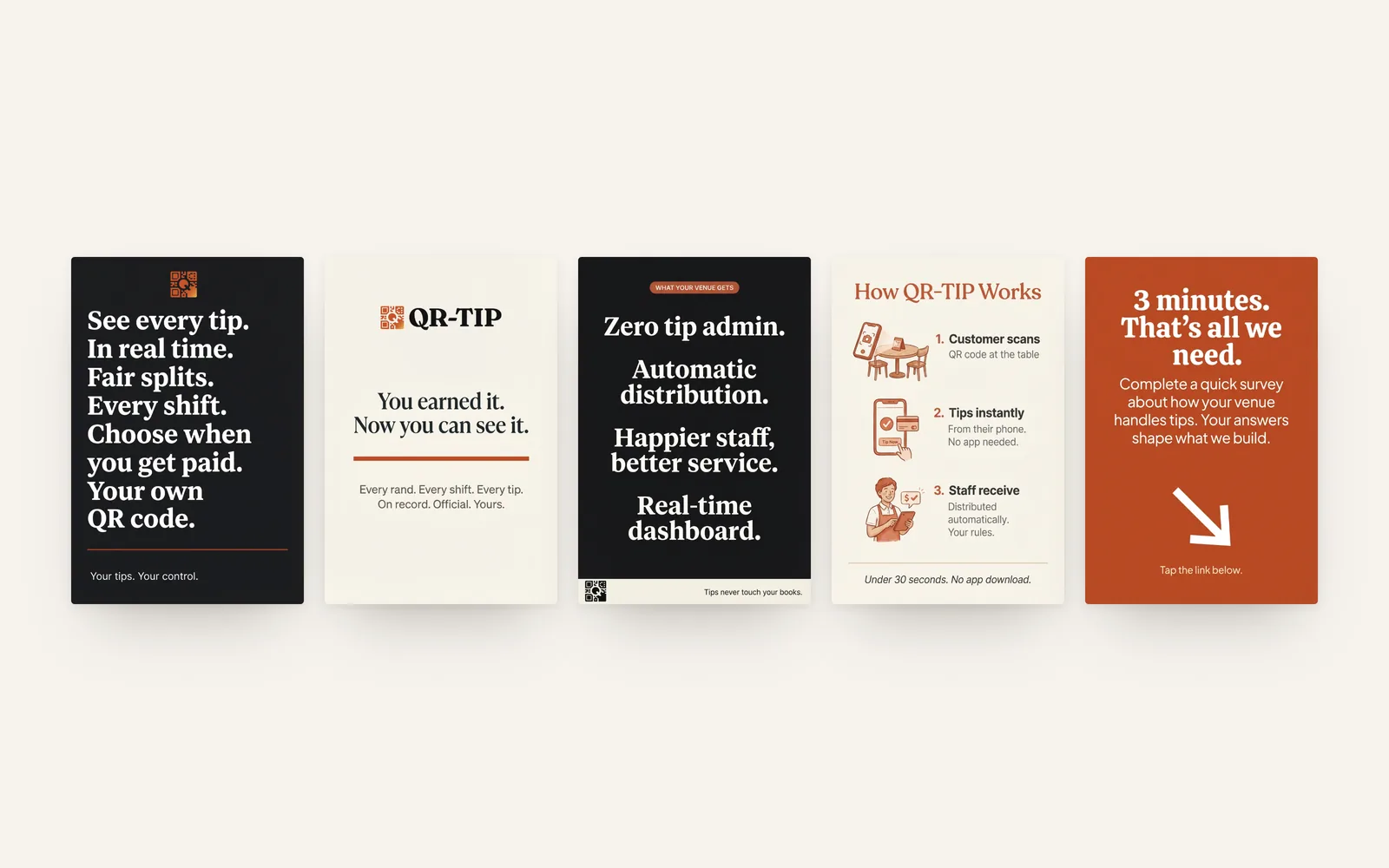
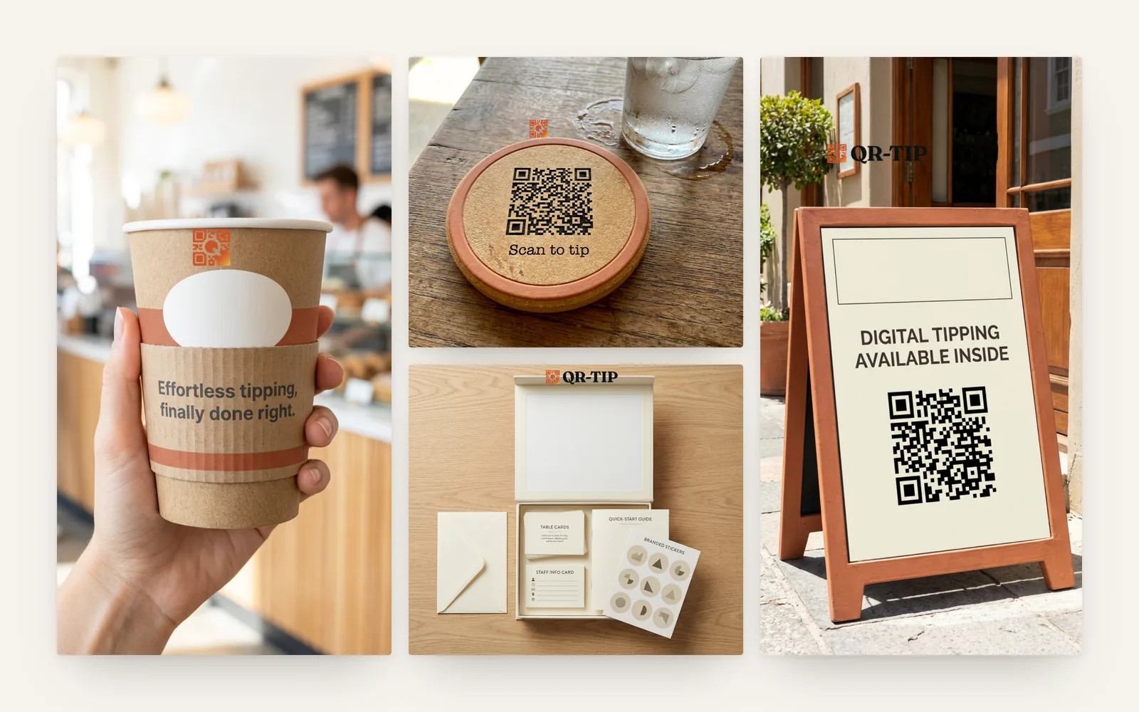
- We built the identity and an 18-page brand kit: the QR mark, a warm terracotta palette, type, taglines and a voice that addresses staff as directly as owners. It carries through to the cards venues hand out and the messages staff receive.
- The line
- Effortless tipping, finally done right.
Gallery
More for QRTip
Next project
Badger - Apps and softwareIf this looks like your problem, start there
Tell us about your business, where you are now and what you want to achieve. We will tell you honestly whether we are the right people for it.